Review: Studio Drift’s Coded Nature exhibition

Guest contributor and European correspondent Lara Chapman visits ‘Coded Nature’ by Studio Drift at the Stedelijk Museum, Amsterdam.

The audience is sporadically positioned around the gallery, hypnotised by the kinetic sculptures performing their entrancing, electrical dance. The 10 flower-like silk structures drop from the ceiling, opening their textile bodies , then retract suddenly upwards, closing. They pause. Sometimes they move separately, at other times together. They are irregular in their speed and pauses, seemingly autonomous. In an indefinite interval, in which all the structures are motionless, I lean towards my friend and whisper, “Wow! It is so satisfying to watch”. Looking around the room I know that this feeling is unanimous. Each person is silently engrossed. “You’ve said that in every room!” my friend replies.

Shylight Zaalopname, Studio Drift: Coded Nature, 2018, Stedelijk Museum Amsterdam. Collection Studio Drift, Amsterdam. Photo: Gert Jan van Rooij The Design Writer
Shylight Zaalopname, Studio Drift: Coded Nature, 2018, Stedelijk Museum Amsterdam. Collection Studio Drift, Amsterdam. Photo: Gert Jan van Rooij

Why is all the work of Studio Drift so satisfying? It could be the level of detail and delicateness in every piece. The small surprises. The fine craftsmanship. But overall, I think it is the sense of slowness and calm that strikingly contrasts our high speed world that makes the exhibition so enjoyable. Read more →

Review: John Wardle installation in Venice

By Penny Craswell

If the purpose of architectural installations is to explore ideas, experiment with new materials and test new forms, then the installation “Somewhere Other” currently on show in Venice has well and truly achieved its brief. John Wardle Architects was one of only two Australian architecture studios (along with Room 11) selected to show as part of the 16th International Architecture Exhibition at the Venice Biennale of Architecture and worked with a range of collaborators on this work.

Somewhere Other by John Wardle Architects and collaborators. Image: Peter Bennetts

The exhibition theme this year, across both this exhibition and the whole biennale, is “Freespace”, through which curators Yvonne Farrell and Shelley McNamara of Irish studio Grafton Architects raise questions about how people relate to buildings and vice versa, what is private and what is public space, and what is the architect’s role in this equation.  Read more →

Review: Hope to Nope: Graphics and Politics 2008-18

Guest contributor and European correspondent Lara Chapman visits the ‘Hope to Nope: Graphics and Politics 2008-18’ exhibition at the Design Museum London.

A visual cacophony of objects including memes, posters, videos, balloons and even a fortune-telling machine come together in a narrative of power and protest at this exhibition. The eclectic collection of pieces traces the turbulent political climate of the past decade and the graphic milestones that have shaped, defined and resisted events in this period. The exhibition also charts recent technological developments and their effect on the production and dissemination of media. Graphic design is presented as a tool that can be harnessed by both the most powerful corporations and the most marginalised groups of society.

Women’s march Washington DC, January 2017. Part of Hope to Nope exhibition at Design Museum London. Images: Chris Wiliams Zoeica

The title of the exhibition references the iconic ‘Hope’ poster designed by Shepard Fairey for Obama’s 2008 election campaign and various appropriations of this, including the viral ‘Nope’ memes of Trump. Between these two moments of American politics, the world has been shaken by a series of charged situations including the Occupy Movement, The Arab Spring, refugee crisis’, LGBT rights, and climate change, which are all represented in the show. Read more →

The history of violet: Artificial Regality by Naama Agassi

By Penny Craswell

The history of the colour purple has led to its high value prior to synthetic production, meaning it has had long associations with royalty, the church and power. This is the subject of designer Naama Agassi’s latest colour research, called Artificial Regality.

Imperial Purple by Naama Agassi. Photo: Talia Rosin

According to Agassi: “In the past, the purple was a coveted colour used to denote wealth and power. This is because until it became artificially manufactured, its production was a lengthy and laborious task. It took as many as 250,000 snails to yield just one ounce of usable dye. As always in design, supply and demand generate desire and prestige. Read more →

Review: Life Force installation by Lie Fhung

By Penny Craswell

Indonesian-born, Hong Kong-based artist Lie Fhung has created an installation work called Life Force II that was recently shown as part of her solo exhibition “Life Force” at the dia.lo.gue artspace in Jakarta.

Lie Fhung, Life Force II 2017, Photo: Sefval Mogalana

The installation features Fhung’s signature materials – clay and metal – consisting of a series of hanging elements in porcelain, glass and copper wire, dramatically lit against the matte black and dark timber-floored exhibition space. Each of the porcelain pieces is fragile, made with super thin clay. Lit as they are, some encased within glass bell jars, these objects acquire a certain precious quality, like little birds with broken wings.  Read more →

The NYC graphic design geek tour

Guest contributor Jane Connory presents a guide to seeing the work of some of America’s graphic design rock stars in the wild, written while she completed the Summer Intensive in Design Criticism at the School of Visual Arts.

The SVA is where Debbie Millman records her Deign Matters podcast. Photo: Jane Connory
The SVA is where Debbie Millman records her Design Matters podcast. Photo: Jane Connory

Manhattan is known for its towering, architectural skyline and this tour begins right in the middle of it, in the magnificent neo-gothic lobby of the Woolworth Building. If you make an appointment, you can take a lift up to the 17th floor to visit an Aladdin’s cave of graphic design treasures in the AIGA (American Institute of Graphic Arts) archives. Filled to the brim with graphic design gems, this treasure trove holds original print runs of every AIGA medalist’s work including breakthrough digital designs by April Greiman. Read more →

Women in Design at Design Tasmania

By Penny Craswell

This is the third year of Women in Design, a conference with an all-female line-up of speakers held in Launceston by Design Tasmania. Attending for the first time this year, my expectations were high – those I’d spoken to who attended previous years had given glowing reports. And I was not disappointed – this conference is inspirational and empowering in a profound way. This year’s theme – design for social engagement – may have added to the overall sense that this group of women are not only inspirational, but also highly authentic, hard-working and intelligent. Each shared her research, design practice, business or personal experience with a level of truth and dedication to the subject that was outstanding.

Women in Design was held in Launceston. Photo: Bruce Moyle, Joffre Street Productions

The whole event began with a beautiful welcome to country by Tasmanian Aboriginal Elder Aunty Patsy Cameron who led a smoking ceremony – the coals from the fire warmed the cold Tasmanian air and sent up clouds of smoke from the burnt eucalyptus leaves. Cameron then prepared a bowl of ochre, painting a moon and two stars on the hand of each woman present, while the men were asked to dip their thumb in the ochre. After moving back inside and a presentation on local produce from Kim Seagram from Fermentasmania and Harvest Market Tastings, a panel discussion was led by Karina Clark, CEO of Design Tasmania and mastermind of this year’s Women in Design event. Clark interviewed two of the makers who worked with Kirsha Kaechele on the Pro Paradox exhibition currently on show in Design Tasmania’s gallery. Sabrina Evans (Sabia) discussed her textile and fashion work including the kimonos she made for the project, while Nana Bayer shared the story of her ceramics, including a series with shapes inspired by the vulva. Kirsha Kaechele, artist and art curator, wife of David Walsh of MONA fame and larger-than-life personality around Tassie, was on hand to describe how the pieces fit into the puzzle – a performative feast-as-installation that evolved from her fertility-themed wedding feast. Read more →

Textile Fashion Style File: The Milan Report 2017

From hand-made to mass production, textiles have the power to tell stories and increasingly furniture designers are finding opportunities to cross over into the fashion world. Penny Craswell explores new concepts and material qualities in textiles and fashion at Milan this year.

Shield by Wiki Somers for Kinnasand.
Shield by Weiki Somers for Kinnasand

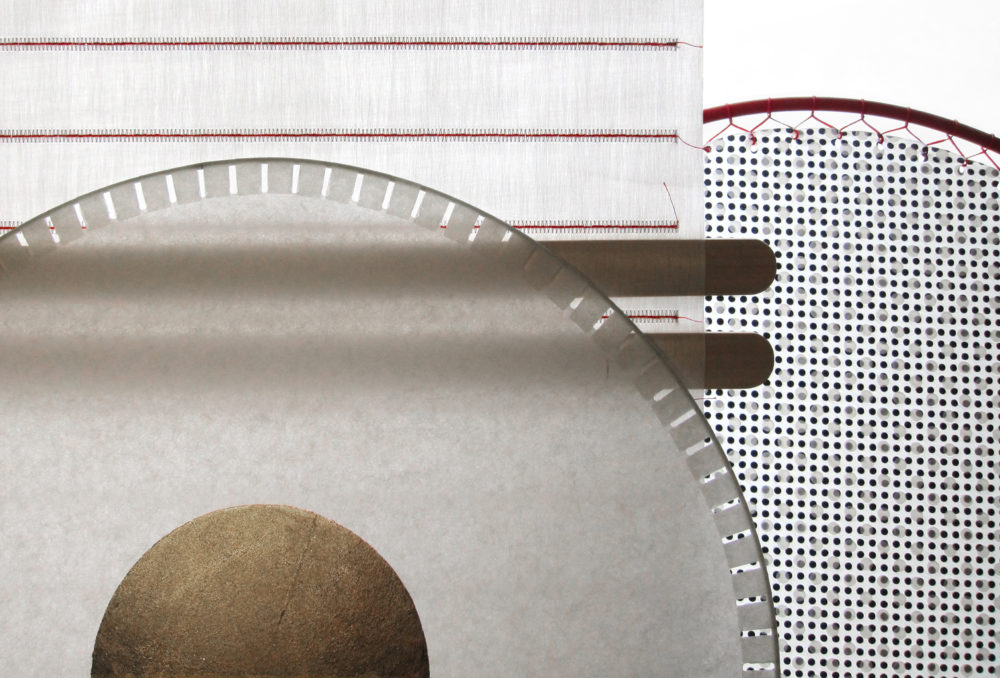
In the flagship showroom of Swedish textile company Kinnasand at Corso Monforte, a series of kite-like shields fly overhead, an installation created by Studio Weiki Somers from Rotterdam. The installation is the material manifestation of a new research initiative called Kinnasand LAB in which design director Isa Glink collaborates with external designers to interpret existing textiles and innovate new products for the brand. The resulting product – Shield – consists of semi-transparent layers of embroidered fabric with wooden panels, like large ice-cream sticks, that can bring rigidity and weight to the fabric or be removed to increase flexibility and transparency. For Weiki Somers the experience of working with Kinnasand made her reflect on the qualities of textiles: “The qualities of a material can strengthen the connection between a person and an object. Especially textiles can stimulate our senses and more than other materials they can evoke memories and emotions, and make you feel at home,” she says. Read more →

Highlights from Milan Design Week 2017

By Penny Craswell

This year, for me, Milan Design Week is all about The Milan Report 2017, a self-publishing venture that I’m launching along with the excellent Giovanna Dunmall (London design expert and writer) and Marcus Piper (multi-talented graphic designer, designer, typographer and writer).

We’re currently putting together a range of design week Q&As, themed features, diaries, picks, contributions from experts, as well as original photography, graphic design and typography – to see for yourself, pre-order here.

And, while I dedicate my time to that, check out a few highlights in picture form as follows – all photos taken by me.

A string quintet plays in the garden of Casa degli Atellani, where Da Vinci lived while painting the last supper – really! – thanks to AirBNB.

Read more →

Defining the character of Australian architecture and design

By Penny Craswell

Australia’s relaxed outdoor lifestyle, unique natural beauty, history and culture are reflected in our approach to architecture. Seven architects and interior designers reflect on the character of Australian design.

House at Big Hill by Kerstin Thompson. Photo: Trevor Mein. Read more on The Design Writer blog.
House at Big Hill by Kerstin Thompson. Photo: Trevor Mein

Australian architects are influenced, like all architects, by the context of their project – whether that’s a bush setting, an ocean view or an urban laneway. In Australia, this sometimes means taking account of proximity to the bush, potential floods and fires, access to fresh water. Our tendency to spend a lot of time in the great outdoors has also had a huge influence on our design choices. Architect Peter Stutchbury believes this has an impact on our architecture: “Recreation permeates our thinking. Verandahs, gardens, courtyards, swimming pools, ponds, clothes lines, tree swings and vegetable gardens were all, until recently, integral to the design brief.” Read more →